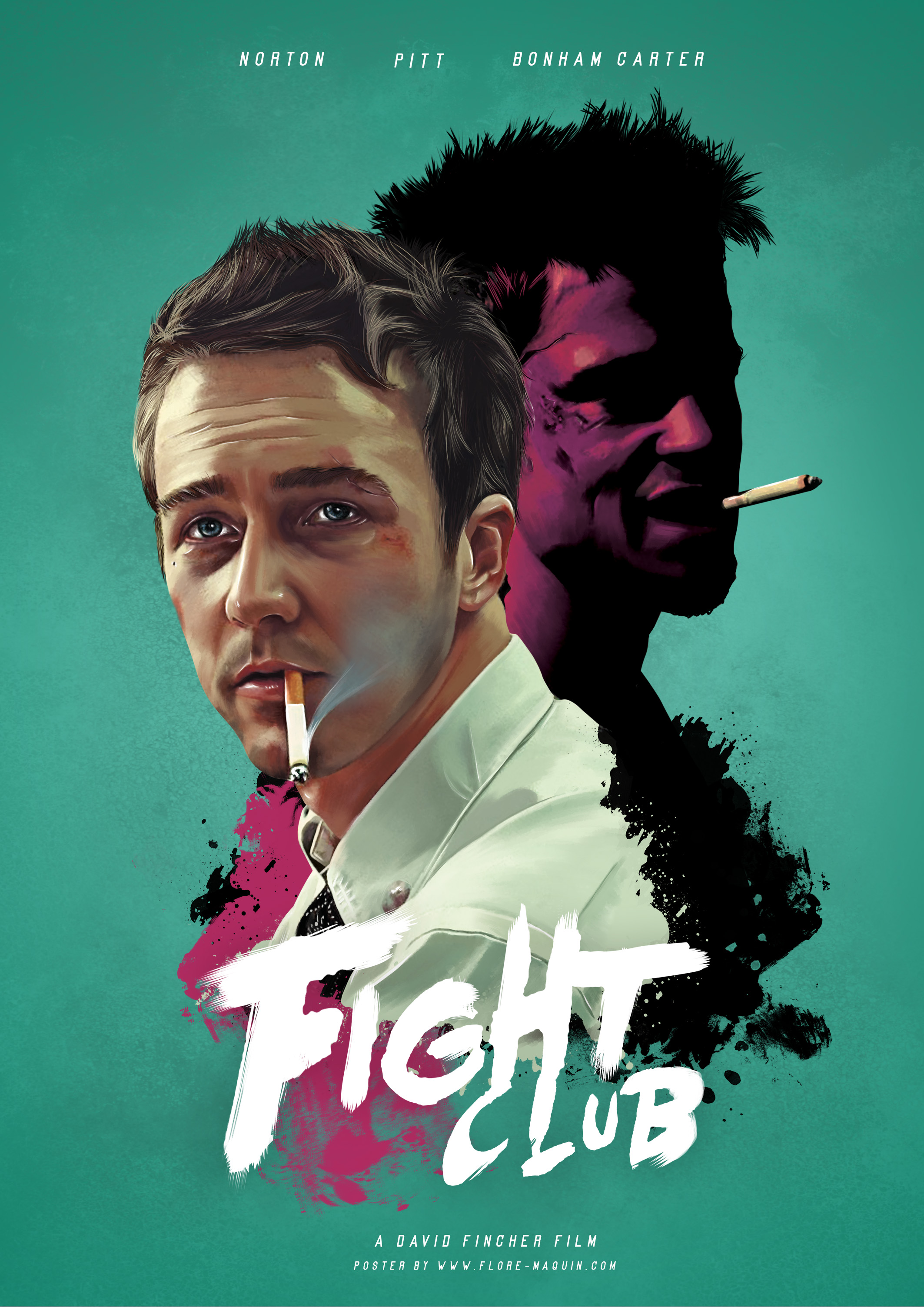
We can see that it has some kind of action in it from the cuts and bruises on the character closest to the audience' face. Since he is the closest to the audience, he is most likely the protagonist. We can also see he is very well lit, even his clothing is a bright white, which suggests that he is a morally good character. Meanwhile next to him is another character shrouded in darkness. This shows he's most likely the antagonist and the darkness to the protagonist's light. He's also looming over the antagonist, possibly hinting at a difference in power and how the protagonist isn't as powerful. They both share the pose of having a cigarette hanging out of their mouth though which shows that they're not entirely different and have some similarities. For anybody that's seen the movie and knows it's ending, all of this is done incredibly purposefully.
No comments:
Post a Comment